Designing a font
When first making this site, I spent some time looking at various fonts to use for the body and headings. The body font I chose originally was Sen, which I liked for the geometric style, but there were many other fonts that I liked but passed on due to one or several letters that I disliked, or disliked but had a few letters that I liked - even Sen had some features that I didn't like.
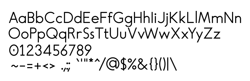
The solution was to try to design my own font, taking inspiration from the typefaces I liked and making the changes I wanted (hence the silly font name, "Timtura"). To make things easier for myself, I set out some rules that I stuck to even if I thought letters didn't look as good as they could - I couldn't trust myself to make the correct choices, but I could at least remain consistent.
These rules were:
- make it a strictly monoline font, with no stroke contrast at all.
- keep to certain multiples of the line width for sizes of the letter forms.
- make all curves sections of circles, and preferably arcs of 15/30/45 degrees.
- keep angled lines to multiples of 5 degrees.
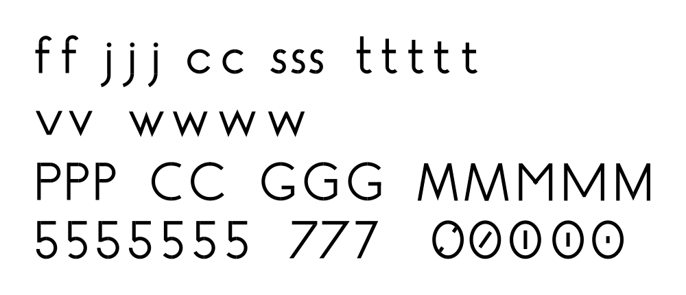
As I worked through the set of glyphs I wanted, I would make multiple variations of a glyph to compare, and sometimes asked an untrained friend for his opinion at a glance. I designed the glyphs in Inkscape, then copied them into FontForge to set the bearings and kerning and for generating the final font files. Because I like to self-host everything related to the site (which isn't much, to be fair), one of my secondary aims was maintaining as small a file size as possible; and one way to do this would be to keep the glyphs simple - a good reason for the sans-serif geometric style.
Once I had all the glyphs made, I did some basic kerning, ran FontForge's autohinter,
then generated a .woff2 file to use on the site. It came out to 4.23KB, less than half
the size of the previous Sen font I was using (which had already been passed through
FontSquirrel's webfont generator
to trim it down). As an additional trick, I base-64 encoded it and put it into a data-uri
in the site's styles so it didn't need an additional request to load; this method uses
~33% more data than the font file (5.8KB instead of 4.23KB) but this is still far below
the size of Sen at 9.33KB. Unfortunately this also means that the browser can't cache the
font file and redownloads it for every page; on a site like this with very few pages this
might be okay as a fun trick, but on anything bigger it would be counterproductive.
Of course, my effort was hardly up to the level of real professionally-made typefaces: it has only one weight (regular), the set of characters is limited, the kerning is bad in many places, and the hinting appears to not work at all sometimes. For two weeks of working a few hours a day I don't feel too bad about it though, and it will probably get some touch-ups later on.
If I were to start again (or remake it for a second version), there are a few things I would do differently: the initial characters I made in Inkscape had to be scaled up to fit the em-square in FontForge, which made all of the points not fit the unit grid correctly and get (very slightly) distorted as a fix. It would be better to know the required size from the start to avoid this. I'd also like to figure out how to properly hint the font, and sort out the iffy kerning.